A profile picture doesn't always need a face, detailed artwork, or a loud design to feel personal. Sometimes the simplest icon creates the strongest mood. That quiet, recognizable look is exactly why a default PFP can feel nostalgic, mysterious, or cozy depending on the colors and style you choose.
Across Discord and TikTok, on Instagram and Pinterest, with WhatsApp and gaming profiles included, these pictures have become more than empty account icons. People customize them with soft pastels, dark shadows, cute expressions, and anime-inspired details — minimal edits that turn something familiar into a tiny piece of digital personality.
Whether an online identity feels dreamy and calm or edgy and anonymous, there is a style for almost every mood. The right image can make a profile feel intentional without trying too hard.
Why a Simple Default PFP Works
A styled default icon is the blank-profile silhouette, customized just enough to feel like a choice. It keeps your privacy, since it shows no real face, while still giving the profile a mood: mysterious, cozy, playful, or calm.

Small details do the work here. Muted colors feel calming, darker tones feel private, and brighter edits add personality. The icon stays simple, which is the point: it reads clearly at any size and never looks unfinished.
Cute Default PFP
Cute versions soften the familiar blank silhouette with tiny hearts, blush effects, bows, and stars. Pastel pink and baby blue, cream and lavender keep the image warm and playful.
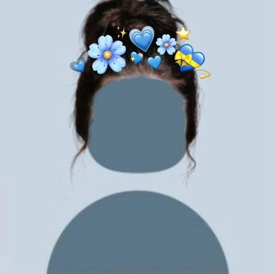
They work on Discord or TikTok when you want something sweet without using a personal photo. The simplicity keeps the profile clean while still showing a gentle personality.
Rounded shapes, soft backgrounds, and small hand-drawn details add the most charm here. Those little touches turn a plain icon into something surprisingly expressive and memorable.
Aesthetic Default PFP
This version turns simplicity into a deliberate mood: faded gradients, soft grain, quiet skies, and muted shadows in balanced neutral tones. The image feels calm rather than empty.
These suit Pinterest and Instagram well, since they blend with styled feeds. A beige or gray design feels minimal, while purple, pink, or midnight tones feel more atmospheric.
Pick an image that echoes the rest of the profile instead of competing with it. When the colors match the posts, bio, and highlights, the whole account feels more cohesive.
Boy Default PFP
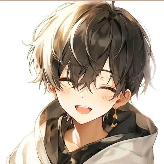
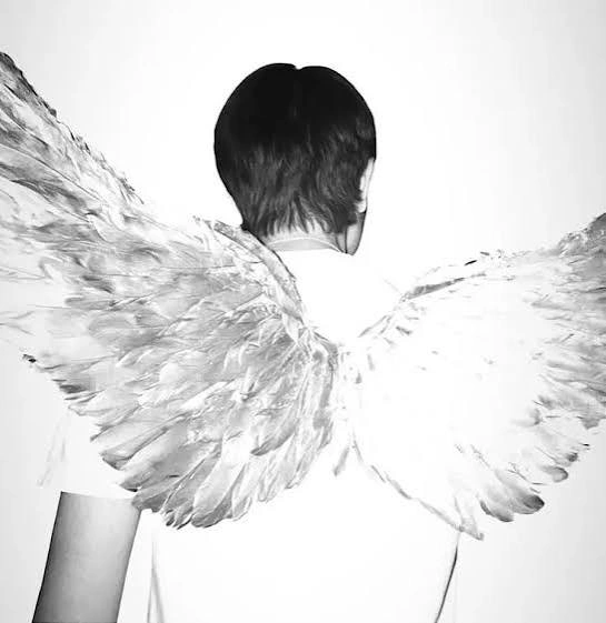
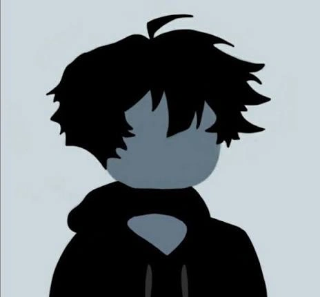
Boy-style default icons lean darker and quieter: hoodies, silhouettes, and simple faceless designs in black, navy, gray, or muted green. The mood runs from relaxed and minimal to edgy or quietly mysterious.
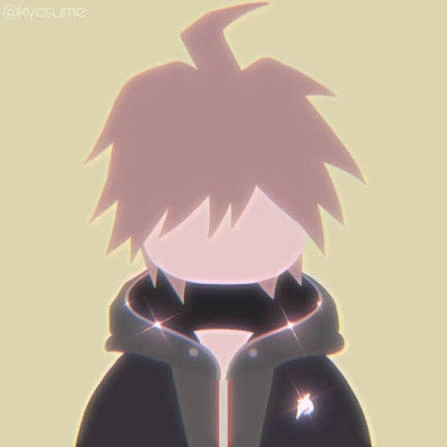
These fit Discord and gaming profiles, where a low-key presence feels natural. Slightly blurred backgrounds or cinematic shadows add personality without making the image busy.
For a softer take, look for illustrated characters, subtle blue tones, clouds, or minimalist line art. The best choice feels natural and matches the online personality instead of looking added at the last minute.
Girl Default PFP
Girl-style designs move between sweet pastels, elegant minimalism, dark feminine moods, and playful illustration. Ribbons, stars, flowers, or headphones with soft light give the icon character.
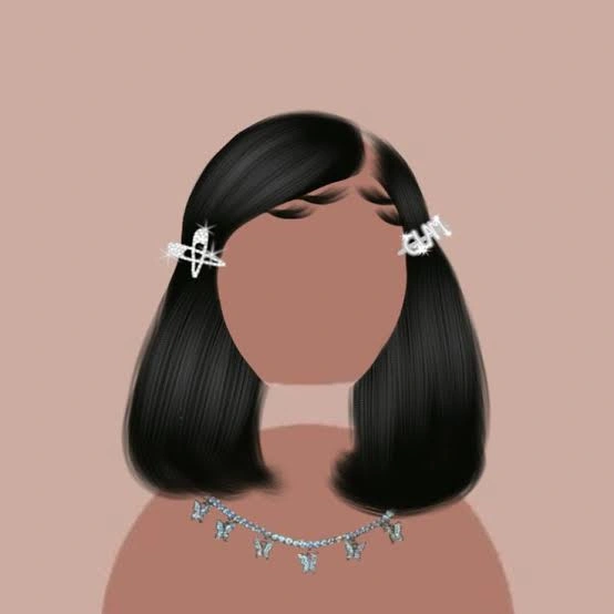
Pink and cream feel cozy, while black, burgundy, or deep purple make the same idea feel more mysterious. These look especially expressive on TikTok, Instagram, and WhatsApp.
Neutral backgrounds and delicate outlines keep things understated. A simple design often stands out more than an overloaded one, especially when its colors complement the username and bio.
Black Default PFP
Black icons have a clean, anonymous quality that feels instantly recognizable. Deep shadows, charcoal gradients, and monochrome illustrations on pure black backgrounds create an understated but confident feel.

This look fits Discord, gaming profiles, and minimalist Instagram accounts. It feels private without looking unfinished, which suits anyone who prefers visual simplicity over colorful or expressive imagery.
A touch of gray, white, or silver with subtle texture keeps the icon visible against dark interfaces. Keep the contrast controlled so the silhouette stays clear even as a tiny circular avatar.
Blue Default PFP
Blue changes the whole feeling of a simple icon. Pale shades feel peaceful and calm, while navy, cobalt, and electric blue bring a cooler, more dramatic energy.
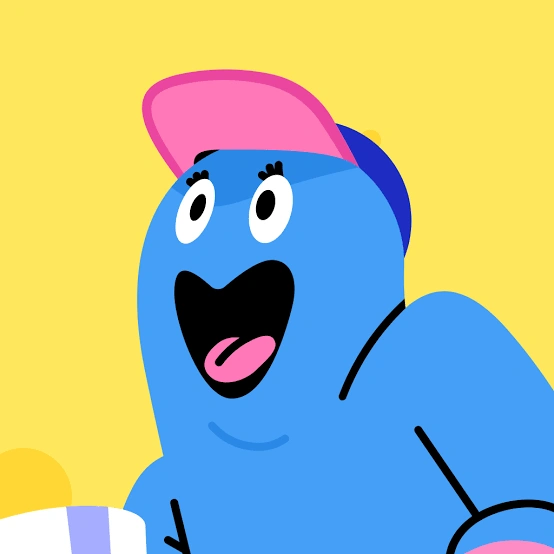
Darker blue edits look sleek on Discord and gaming profiles without feeling serious. Soft sky-blue versions suit Pinterest, TikTok, and Instagram accounts built around calming or pastel visuals.
Match the shade to the rest of the profile. Clouds, stars, gentle gradients, and watery textures add depth while keeping the minimal charm that makes the style work.
Discord Default PFP
Discord icons need to stay clear at a small size, which makes simple avatars surprisingly effective. Strong silhouettes, clean backgrounds, and recognizable shapes stay easy to notice in busy servers and group chats.

Dark themes blend with Discord's interface, but pastel pink and blue, or purple with white, create stronger contrast. Cute edits feel playful, while monochrome versions give an account a quieter, more mysterious personality.
Check how the picture looks beside the username and role color. A default-style icon that echoes the server's tone feels deliberate rather than like a placeholder.
More Default PFPs
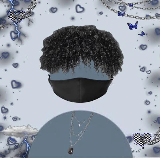
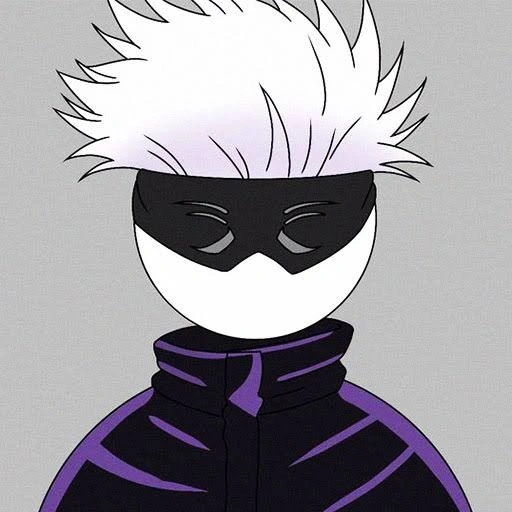
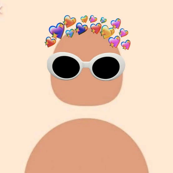
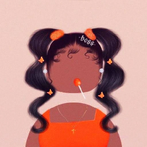
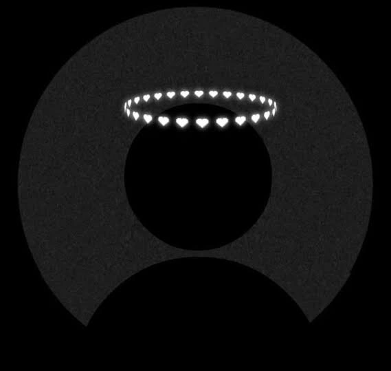
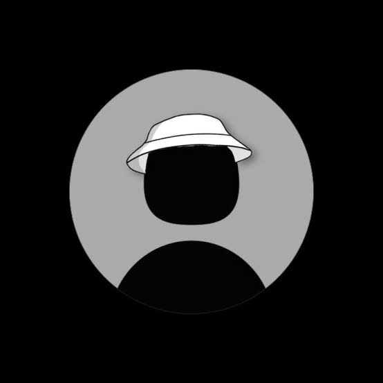
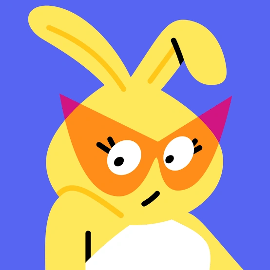
Browse the full gallery below — tap any image to view it full size, then save it as your profile picture.











Frequently Asked Questions
Why use a default-style PFP instead of a photo?
Privacy, mostly. A styled default icon shows personality without showing a real face, and it stays recognizable across platforms. It can feel mysterious, cozy, or playful depending on the colors and details you choose.
Which default PFP works best on Discord?
Simple designs with strong silhouettes and clean backgrounds. Dark themes blend with Discord's interface, while pastel pink, blue, or purple with white create stronger contrast in member lists.
Are black default PFPs too plain?
Not if the texture is right. Deep shadows and charcoal gradients create an understated, confident look, and a touch of gray or silver keeps the icon visible against dark interfaces. The simplicity is the style.
What makes a cute default PFP?
Start with the familiar blank-profile shape, then add small details: tiny hearts, blush effects, bows, and stars. Pastel pink and baby blue, cream and lavender keep it warm and playful without getting busy.
Can a default PFP look aesthetic?
Yes. Faded gradients, soft grain, quiet skies, and muted shadows turn simplicity into a deliberate mood. The effect works best when the colors echo the rest of the profile, from posts to highlights.